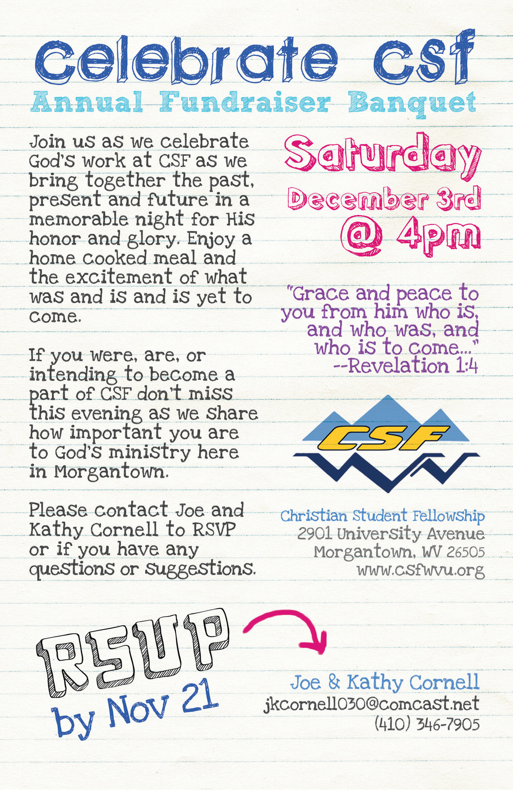
We decided it was time to freshen up a bit. We now have a refreshed logo and a brand new website. Here is a brief rundown of all the changes made (I'll try not to get too geeky):
The Logo
The logo kept the basic idea of the orginal, but we modernized it and shuffled a few elements around. The color scheme is more vibrant and the new layout allows us to use single color versions when needed. You'll be seeing the logo in a few different arrangements and styles...here are a few options below:
Read more
